
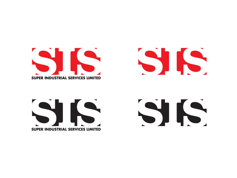
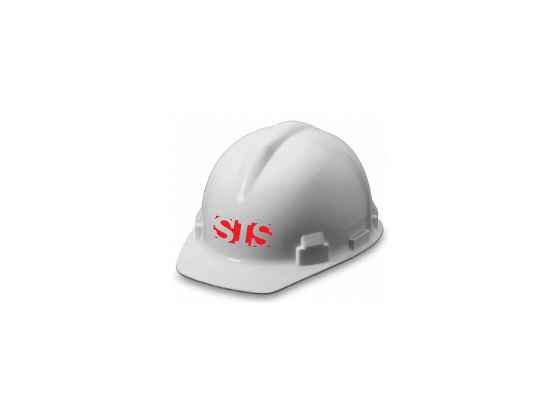
I was contracted by a third party company to create 2 logo re-designs for Super Industrial Services Limited. These were what I came up with.

Inspired by the original logo,keeping the national colours and placing the text into a shape,
this new logo aims to better execute a structural symbol for Super Industrial Services
Limited. By making the shape a box/rectangle, and having the letters fit tightly in the
shape, it aims to portray strength with the sharper edges and the boldness of the type. It
also represents a building block as it calls to mind the toy blocks children play with, but
giving it a more adult feel with sharp instead of rounded (child proof) corners. I chose a
slab serif typeface (which by design, has a constructive feel) for “SIS” because the ‘slabs’
i.e. the boxes on the ends of the letters repeat that form created by the logo as a whole,
giving a reinforcement of blocks and structure. In addition, the “I” resembles a pillar or
beam used in construction and helps draw industrial, building representations to mind.
Lastly, the font used for the name of the company is a simple, modern sans serif typeface,
so as not to distract too much for the shape created above, yet still representing strength
by choosing a bold weight. Having the text run below the block shape of the SIS symbol in
a different colour, it creates a sort of ground representation with the block above the
ground, portraying growth.

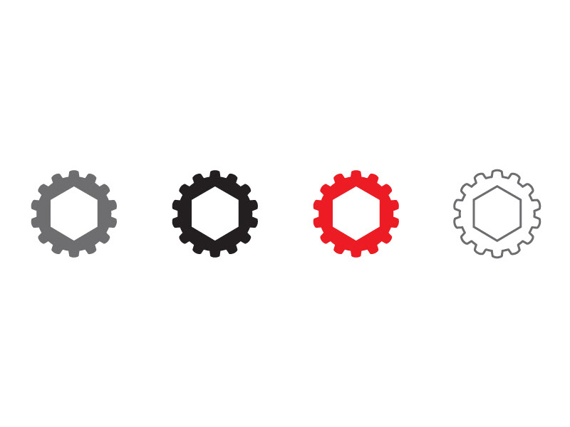
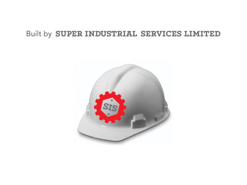
Using the same colours from the present logo a new logo was created to become a symbol
that would be easily recognizable and could become affiliated with Super Industrial
Services Limited. This symbol was created using simplified shapes of items that are
associated with key representational words like “industrial” and “construction”. It is meant
to represent strength, with the shape of a nut at the centre which holds everything
together as well as, movement, as it calls to mind the gears in a machine that makes
everything progress/move. Again a slab serif typeface (which by design, has a constructive
feel) was chosen to compliment the style of the shape and reinforce that sense of structure
and strength.
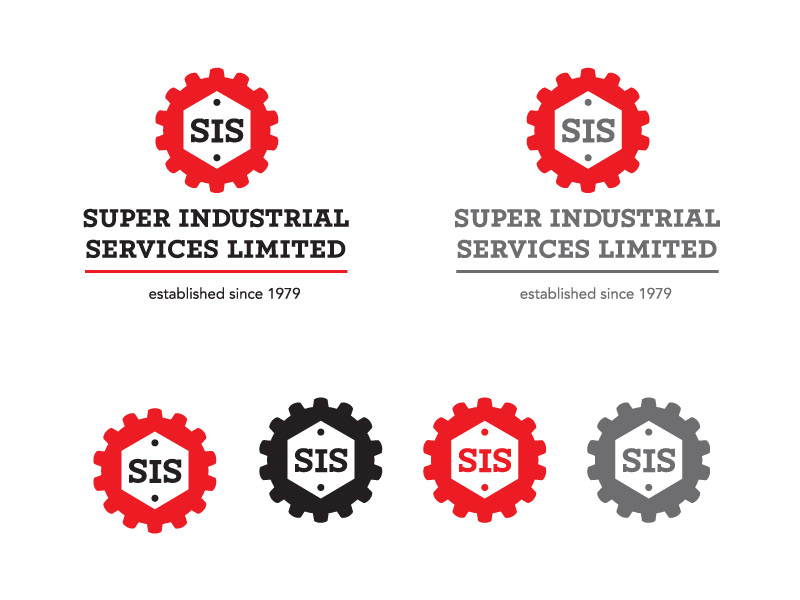
The second logo was prefered. However, the client was not ready to change their logo.